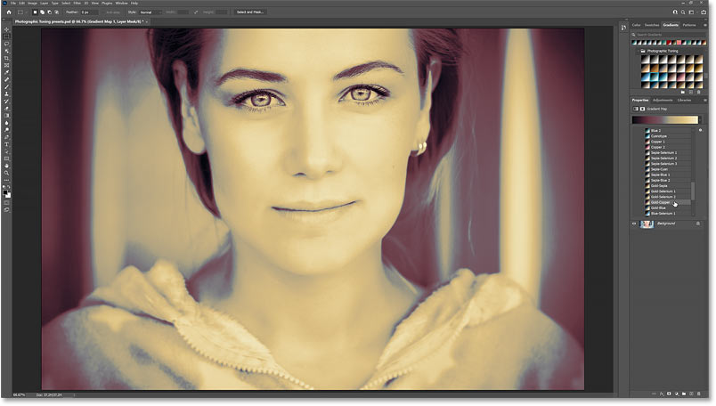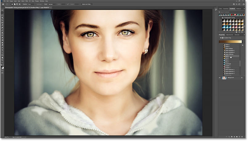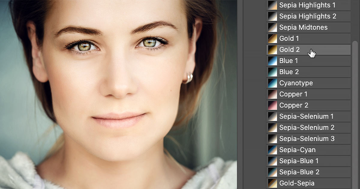

Learn how to add color grading effects to your images with a single click using Photoshop’s Photographic Toning presets, and where to find them in Photoshop 2021!
Written by Steve Patterson.
In this tutorial, I show you where to find Photoshop’s hidden color grading presets and how to use them to instantly color grade your images. Way back in Photoshop CS6, Adobe added a new set of gradients called the Photographic Toning presets. And these are gradients designed by a photographer specifically for color grading.
But in Photoshop 2020, Adobe added a ton of brand new gradients. And to make room for them, all of Photoshop’s classic gradients, including the Photographic Toning presets, were moved to a secret location. I’ll show you where to find them and how to use them to add some great color effects to your images with a single click!
To follow along, you’ll want to be using Photoshop 2020 or later. I’m using Photoshop 2021. And to learn more about color grading, including how to use your own colors, check out my previous Color Grading Images with Gradient Maps tutorial.
Let’s get started!
Step 1: Open your image
Start by opening your image. I’ll use this image from Adobe Stock:

The original image.
Step 2: Open the Gradients panel
The Photographic Toning presets were designed to be used with a Gradient Map image adjustment. But before adding a Gradient Map, we first need to load the Photographic Toning presets. And these days, they’re found in a group called Legacy Gradients.
To load the Legacy Gradients group, open the Gradients panel:

Opening the Gradients panel.
If you’re not seeing the Gradients panel, go up to the Window menu in the Menu Bar and choose Gradients. But if a checkmark appears next to its name, it means that the panel is already open, and selecting it from the Window menu will close it:

Going to Window > Gradients.
Related: Find all of Photoshop’s missing gradients, patterns and shapes!
Step 3: Load the Legacy Gradients group
The Gradients panel holds all the new gradients that were added back in Photoshop 2020, all divided into groups. But the older gradients, including the Photographic Toning presets that we’re looking for, need to be loaded separately:

Scrolling through the default gradient groups in the Gradients panel.
To load them, click the Gradients panel menu icon:
![]()
Clicking the menu icon.
And choose Legacy Gradients from the menu:

Loading the Legacy Gradients.
Then scroll to the bottom of the gradients and a new Legacy Gradients
group will appear:

The Legacy Gradients group is loaded.
Viewing the Photographic Toning presets
Twirl the group open by clicking the arrow next to its folder icon:

Opening the Legacy Gradients group.
And inside are all of Photoshop’s classic gradients, again divided into groups, including the Photographic Toning group:

Scrolling down to the Photographic Toning group.
Open the Photographic Toning folder and here we find all of the color grading presets:

The Photographic Toning preset gradients.
Step 4: Add a Gradient Map adjustment layer
Since the Photographic Toning presets were designed to be used with a Gradient Map adjustment, we can’t simply select them from the Gradients panel. Instead, we first need to add a Gradient Map adjustment layer.
In the Layers panel, click the New Fill or Adjustment Layer icon at the bottom:
![]()
Clicking the New Fill or Adjustment Layer icon.
And choose Gradient Map from the list:

Choosing Gradient Map.
A Gradient Map adjustment layer appears above the image on the Background layer:

The Gradient Map adjustment layer above the image.
And by default, the Gradient Map converts the image to black and white. I cover why that is, and how Gradient Maps work, in my Color Grading Images with Gradient Maps tutorial:

The Gradient Map converts the image to black and white.
Step 5: Open the Gradient Picker
The gradient that the Gradient Map is currently using appears in the preview bar in the Properties panel:

The Properties panel shows the current gradient.
To view all of the gradient presets you can choose from, open the Gradient Picker by clicking the small arrow to the right of the preview bar. Don’t click on the preview bar itself, otherwise you’ll open the larger Gradient Editor. We only need the Gradient Picker, so click the arrow:

Clicking the arrow next to the preview bar.
Step 6: Open the Legacy Gradients group
In the Gradient Picker, you’ll find the same list of gradients that we saw in the Gradients panel. Scroll down to the bottom of the list to get to the Legacy Gradients group:

Scrolling to the Legacy Gradients in the Gradient Picker.
Step 7: Open the Photographic Toning group
Twirl the Legacy Gradients group open and scroll down to the Photographic Toning group:

Scrolling to the Photographic Toning group.
Then twirl the Photographic Toning group open to once again view all the color grading presets inside it:

The Photographic Toning presets.
How to view the names of the presets
By default, the presets appear as thumbnails, and a lot of them look very similar. So you may want to switch from the thumbnail view to a list of names. To do that, click the Gradient Picker’s gear icon:
![]()
Clicking the gear icon.
And choose Small List:

Choosing the Small List view option.
Step 8: Choose a gradient preset from the group
Then scroll through the list to view all the presets you can choose from. You can click and drag the bottom right corner of the Gradient Picker downward to expand it and view more gradients at once:

Expanding the Gradient Picker by dragging the bottom right corner.
Select any of the gradients to see what it looks like with your image.
Most of the Photographic Toning presets are variations of blues, cyans, oranges and browns, including sepia, since they tend to work well for color grading. Here I’ve selected the Sepia 1 preset:

The color grading effect using the Sepia 1 preset.
But there are also some reddish tones, like copper. Here’s the result with the Copper 1 preset:

The Copper 1 preset effect.
And some nice silver tones, like the Selenium 2 preset:

The Selenium 2 preset.
How to scroll through the gradients
An easy way to try all the presets out is to click on a gradient to select it, and then move up and down through the list using the Up and Down arrow keys on your keyboard.
I’ll choose the Gold-Copper preset, mostly because it looks pretty bad at the moment, at least with this image. But up next, I’ll show you how to fix that by blending the gradient colors in with your photo’s original colors. Once you’ve chosen a preset, close the Gradient Picker either by clicking outside it or by pressing Enter (Win) / Return (Mac) on your keyboard:

Not all gradients will look good at first, but there are ways to fix it.
Step 9: Change the Gradient Map’s opacity
By default, the color grading presets completely replace the photo’s original colors. But that’s not usually what we want. Instead, we want to blend the gradient colors into the originals. And an easy way to do that is to lower the Gradient Map adjustment layer’s Opacity value in the Layers panel.
If I lower the opacity from 100 percent down to 40 percent:

Lowering the opacity of the Gradient Map.
I’m mixing 40 percent of the gradient colors with 60 percent of the original colors.
For comparison, on the left is the Gradient Map at 100 percent opacity, and on the right is with the opacity lowered to 40 percent. And already, we see a big improvement:

The Gradient Map effect at 100% (left) and 40% (right) opacity.
Related: How to blend images together in Photoshop!
Comparing the color grading with the original image
You can toggle the Gradient Map on and off to compare the original and color graded versions of the image by clicking its visibility icon:
![]()
Clicking the adjustment layer’s visibility icon.
On the left is the original image, and on the right with the color grading (again at 40 percent opacity):

The original image (left) and the color graded version (right).
Step 10: Change the Gradient Map’s blend mode
Another, and more powerful, way to blend the gradient colors with the image is by changing the Gradient Map’s blend mode. The Blend Mode option is directly across from the Opacity option in the Layers panel.
The default blend mode is Normal, which simply means that there is no interaction between the Gradient Map adjustment layer and the image below it. But two blend modes to try that work great with color grading are Color and Soft Light:

The Blend Mode option set to Normal (the default).
The Color blend mode
The Color blend mode keeps the brightness values of the original image and blends only the colors from the gradient. This keeps the overall contrast between the two versions the same, and helps to avoid any issues with color banding that appear when using the Normal blend mode:

Changing the Gradient Map’s blend mode to Color.
On the left is with the Gradient Map’s blend mode set to Normal, and on the right is with Color. Both are using an opacity of 100 percent. Notice how the contrast improves with the Color blend mode, and that much of the banding seen with the Normal blend mode has disappeared:

The Normal (left) and Color (right) blend modes.
Get my Complete Guide to Layer Blend Modes PDF!
The Soft Light blend mode
The Soft Light blend mode is one of a group of blend modes that increase contrast. Soft Light uses the dark colors in the gradient to push the shadows even darker, and the light colors to push the highlights even brighter. This results in the color graded version having higher contrast than the original image:

Changing the blend mode to Soft Light.
On the left is the original image, and on the right is with the Gradient Map set to Soft Light:

The original image (left) and the Gradient Map set to Soft Light (right).
And here is a comparison of all three blend modes, with Normal on the left, Color in the middle and Soft Light on the right. No matter which blend mode you choose, you can also combine it with the Opacity option that we looked at earlier to fade the Gradient Map adjustment layer and fine-tune the results:

The same Photographic Toning preset set to Normal (left), Color (middle) and Soft Light (right).
Trying other Photographic Toning presets
Of course, you can always go back and try different Photographic Toning presets by returning to the Properties panel and clicking the arrow next to the preview bar to reopen the Gradient Picker:

Reopening the Gradient Picker in the Properties panel.
Then choose a different preset from the list. Here’s what the Gold 1 preset looks like (using the Soft Light blend mode):

The Gold 1 preset effect.
And you can change the new gradient’s blend mode and opacity value in the Layers panel, just as we did earlier. Here’s the Gold 1 preset result after changing the blend mode from Soft Light to Color and lowering the opacity to 40 percent:

The Gold 1 preset, Color blend mode, 40 percent opacity.
And there we have it! That’s how to load and use the Photographic Toning presets to color grade images with a single click in Photoshop!
Be sure to check out my Color Grading Images with Gradient Maps tutorial if you haven’t already to learn much more about color grading. Visit my Photoshop Basics or Photo Editing sections for more topics. And don’t forget, all of my Photoshop tutorials are available to download as PDFs!
Source: PhotoshopEssentials
